In addition, any charts for financial instruments in this article are for education only. The examples shown here do not constitute trading advice or a solicitation to buy or sell any financial instrument. Past performance is not necessarily an indication of future performance.
If you would like to learn more, please read this Disclaimer for details.
The Ichimoku Cloud, also known as the Ichimoku Kinko Hyo, is a versatile technical analysis indicator developed by Goichi Hosoda in the 1930s.
After tweaking it for years, Hosoda felt he found the ideal settings for his indicator. Now, it helps traders identify support and resistance levels, gauge trend direction, and determine potential entry and exit points.
We’ll cover the calculations that go into this tool, as well as some of the popular theories used while trading it.
The Ingredients of the Ichimoku Cloud
The Ichimoku Cloud consists of five main components that work together to produce its unique look.
The Tenkan-sen is the fastest-moving and most sensitive line in the Ichimoku Cloud. It represents the midpoint of the highest and lowest price points over a given period. The Tenkan-sen is used to identify short-term trends and potential reversals. When the Tenkan-sen crosses above the Kijun-sen, it generates a bullish signal. A cross below the Kijun-sen indicates a bearish signal.
Tenkan-sen (Conversion Line)
To calculate the Tenkan-sen, use the following formula:
(Highest High + Lowest Low) / 2 for the last 9 periods
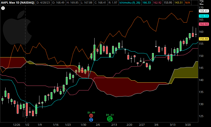
In the above graphic, this is the teal colored line.
Kijun-sen (Base Line)
The Kijun-sen serves as a slower-moving, less sensitive line that represents the midpoint of the highest and lowest price points over a longer period. It can be used to identify medium-term trends and confirm the signals generated by the Tenkan-sen. When the Kijun-sen is rising, it suggests an uptrend, while a declining Kijun-sen indicates a downtrend.
To calculate the Kijun-sen, use the following formula:
(Highest High + Lowest Low) / 2 for the last 26 periods
In the above graphic, this is the red line that more slowly follows along the trend as the Tenkan-sen occasionally leads it.
Senkou Span A (Leading Span A)
Senkou Span A is one of the two lines that form the Ichimoku Cloud. This line representsa key support or resistance level, depending on its position relative to the current price. When Senkou Span A is above the current price, it acts as a support level, while if it is below the price, it serves as a resistance level.
To calculate the Senkou Span A, use the following formula:
(Tenkan-sen + Kijun-sen) / 2, plotted 26 periods ahead
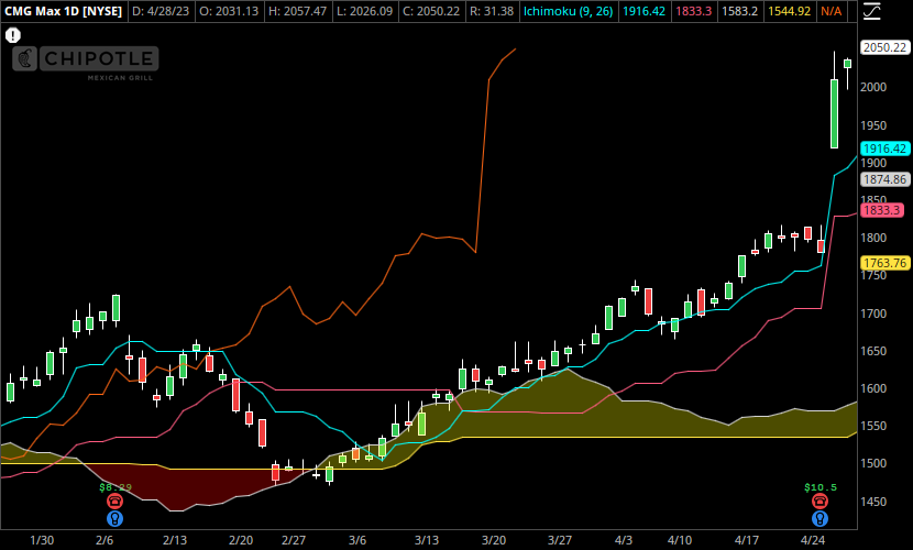
In the graphic below, this is the top line of the “cloud” formation shown along the 1600 level of CMG.
Senkou Span B (Leading Span B)
Senkou Span B is the second line that forms the Ichimoku Cloud. It is calculated by finding the midpoint of the highest and lowest price points over a longer period, typically 52 periods, and plotted 26 periods ahead of the current price. Like Senkou Span A, Senkou Span B also represents support or resistance levels, depending on its position relative to the current price.
To calculate the Senkou Span B, use the following formula:
(Highest High + Lowest Low) / 2 for the last 52 periods, plotted 26 periods ahead
In the above graphic, this is the bottom line of the “cloud” formation shown along the 1600 level of CMG.
Chikou Span (Lagging Span)
The Chikou Span is the lagging component of the Ichimoku Cloud. It is used to confirm the trend direction and provide additional insights into potential support and resistance levels. When the Chikou Span is above the price, it suggests a bullish trend, while a Chikou Span below the price indicates a bearish trend.
To calculate the Chikou Span, use the following formula:
Closing price, plotted 26 periods behind
In the above graphic, this is the other red line that abruptly jumps up in the middle of the chart.
Interpreting the Ichimoku Cloud
The cloud, or Kumo, is perhaps the distinguishing feature of the Ichimoku Cloud indicator. This helps traders identify what the current trend is, especially when the cloud is growing in size.
Trend Identification
One of the primary uses of the Ichimoku Cloud is to identify the prevailing trend. When the price is above the cloud, it indicates a bullish trend, and when the price is below the cloud, it suggests a bearish trend.
If the price is within the cloud, it signals a potential trend reversal or a period of consolidation.
While trend identification is typically rather easy, the Ichimoku Cloud provides multiple insights regarding trend strength.
Trend Strength
In addition to general trend identification, traders can locate strengthening or weakening of trends.
The distance between the Tenkan-sen and Kijun-sen lines can be used to determine that a trend is getting stronger, if the gap is widening.
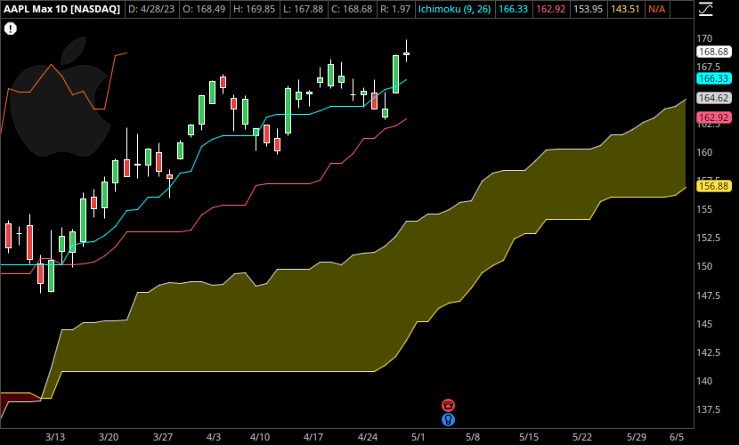
In addition, when the Leading Span A is rising and above the Leading Span B, the cloud appears light, as shown in the chart below.
On the other hand, when in a downtrend, and the Leading Span A falls below further below the Leading Span B, the cloud is colored red.
Support and Resistance
Finally, the cloud is shifted forward 26 days. On a basic level, the cloud itself, as well as the Tenkan-sen and Kijun-sen lines, can act as dynamic support or resistance levels.
A wider cloud indicates strong support or resistance levels, while a narrow cloud suggests weaker support or resistance.
Limitations of the Ichimoku Cloud Indicator
Complexity (and Clutter)
The Ichimoku Cloud consists of multiple components, which can make it challenging for novice traders to understand and interpret correctly. The presence of several lines and the cloud on the chart sometimes appear overwhelming, leading to confusion and misinterpretation.
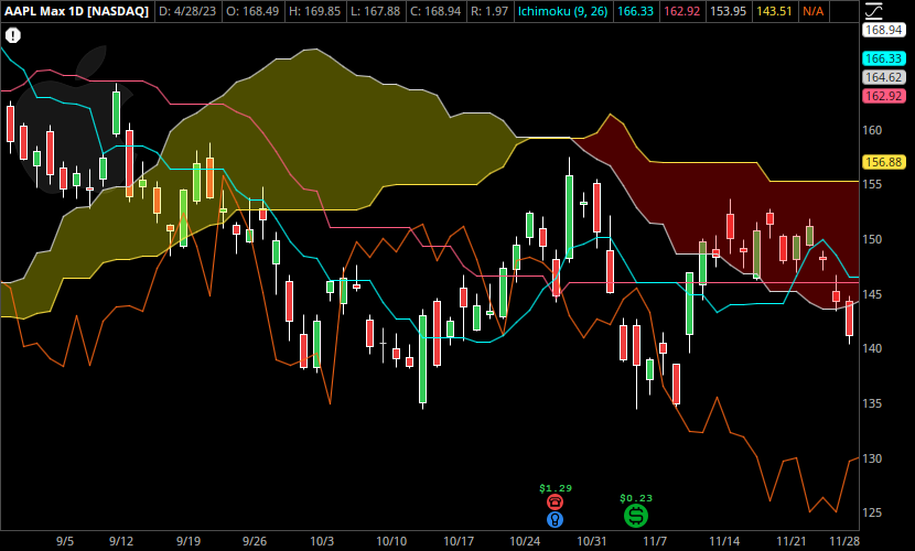
I feel that it makes a chart look cluttered, because of the way it projects its clouds directly on to price at times. Take a look at the Ichimoku Cloud below, during a range-bound market.
Lagging Nature
The majority of the Ichimoku Cloud components’ formulas use historical data, making it a lagging indicator. Its forecasted clouds also seem to follow a simplistic formula, which means it’s better to use it as support/resistance than a genuine forecast of trend progression.
Plus, for support and resistance, other tools may be better. Using just the Ichimoku seems like it will cause you to get out of moves quite late at times.
Limitations in Sideways Markets
The Ichimoku Cloud works best in trending markets, as it helps identify the direction and strength of the trend. However, during periods of consolidation or range-bound markets, the indicator may provide less reliable signals, leading to whipsaw trades and potential losses.
One-Size-Fits-All Approach
The Ichimoku Cloud uses a fixed set of parameters for its calculations, which might not suit all trading styles or timeframes. Traders report that they found more success in the 4 Hour and Daily time frames, with more difficulty in shorter term trading.
For our day trading purposes, it may be less useful and more congetsed. Note that it is possible to adjust these parameters. But considering the amount of work completed to determine the default settings, it’s probable that you will only have more difficulty by doing so.
Conclusion
With most technical indicators, it’s important to pair them with something like a moving average, to have a more complete picture. The Ichimoku Cloud attempts to tackle this issue by itself.
The power of this tool lies in its ability to depict numerous graphical representations of market behavior in one place. Having multiple indicators stacked below the chart can quickly become an eyesore. Keeping everything together on a single chart instead might be game-changing. It’s no surprise this indicator is still popular today.
Leave a Reply